

“It’s funny how the beauty of art has so much more to do with the frame than the artwork itself.” -Chuck Palahniuk, Choke
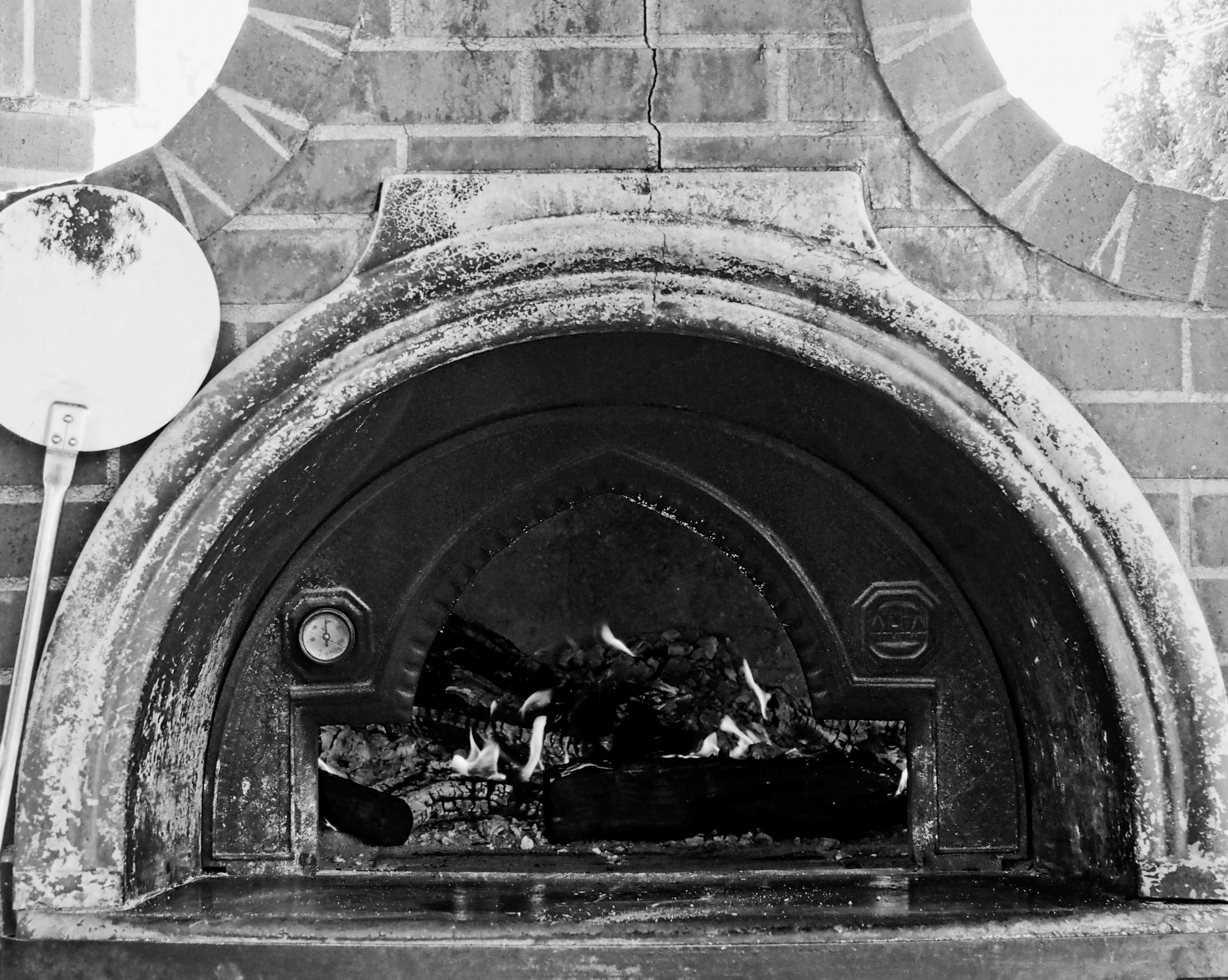
This week my assignment for the 52-week photo challenge was to capture something using framing. I visited High-Hand Nursery and although it provided me with lots of beautiful shots, I struggled with symmetry and straight lines. Ultimately, my shots fell short. I wonder if I’m trying too hard. It felt easier to take photos when I wasn’t searching for a specific type of shot. Am I overthinking or is this part of the learning process?
My daughter is taking a photography class and my mother recently got a camera, so both joined me at the nursery. It was fun to walk around together taking photos and it was even more fun to see how different all our shots are.
Let me know which shot you think best uses the concept of framing. I’ve added numbers to the photos this week so it’s easier to comment. I’ve also included a few extra photos from the day. Can you guess which photo is my favorite? Have a wonderful week!


- Photos were taken with an Olympus OM-D and edited with ON1 Photo RAW
- If you want to join the 52 Photo Challenge, you can find all the information at nicolesy.com
52 Photo Challenge
Week 1: Bokeh
Week 2: Silhouette
Week 3: Black and White
Week 4: Motion Blur
Week 5: Texture

Bridgette, the photos are lovely
LikeLiked by 2 people
Thank you so much, Brenda ❤️
LikeLiked by 2 people
For framing, I like the first photo best because it is grayscale and it has a sense of nostalgia. ❤️☺️
LikeLiked by 2 people
Thanks, John. Framing seemed like such an east concept, but I found it hard. I do think I’m probably overthinking it ❤️
LikeLiked by 2 people
Maybe. My method is to simply shoot what catches my eye. No photo challenges. Sometimes, I see the larger picture in my mind, then imagine using only a portion of that photo via cropping. A photo within a photo you could say.
LikeLiked by 2 people
Yes, I think that’s how I work best too. The photos at the end of the post represent me just shooting things I find pretty or interesting. They are much stronger.
LikeLiked by 2 people
It’s amazing how much creativity you can do with a camera!
LikeLiked by 2 people
Indeed! It’s so fun!
LikeLiked by 2 people
#2 is a really nice example of framing. It draws the viewer in. #4 is a terrific image and is more about a frame than the act of framing, I think. The others that appeal to me most are #5 & #7 – well, I love leaves! Wandering around a nursery with your daughter & mother sounds like heaven. 🙂
LikeLiked by 1 person
Gorgeous photos, Brigitte! My definition, perhaps different than your instructor’s, is having one or more elements that delineate (frame) the actual subject of the photo. To me framing inherently works off of depth-of-field. My go-to is to use branches in the near- or mid-distance to frame the subject which is further away. I like how your top photo of the greenhouse frames with that edge of wall at the outside of the photo. What if you had pulled back just a bit? By seeing more wall, we would get a slightly stronger presence from it. The wall then would be saying more clearly, “hey look through this window here!” If there was something small but interesting on that wall, so much the better. Whaddaya think?
LikeLiked by 2 people
I fully agree with you! There was a tree in the way and I took several shots but I couldn’t get the lines right-the outside walls were never equally in the picture or even. I spent hours trying to crop and fix them, but I think I just missed the shot. It was a good learning experience-so close to good.
LikeLiked by 1 person
Hmmm. Maybe the edge of the tree could have been incorporated as well? Get close to tree, use as a foreground element?
LikeLiked by 2 people
That probably would have been better. I probably gave up on the shot too early and should have taken about a dozen more.
LikeLiked by 1 person
Then again… you were there, I was not. In my mind I see a perfect shot because I am not bound by reality!
LikeLiked by 2 people
1’s greyscale works really well with the varying lines & depth that draws the eye. 🙂
The contrast in 5 was beautifully chosen – eggshell blue sky vs rouge-brown twigs and pale green fernlike leaves.
9 was a great frame too – that burst of vivid colour nestled in the spruce-like fronds.
Lovely choices of composition! ❤
LikeLiked by 3 people
Thank you for the feedback, Tom. 9 is one of my favorites too. I loved the colors.
LikeLiked by 2 people
I liked 9. The needles being the frame for simple symmetry. Lovely to have your mum and daughter with you. A memory to keep in photographs.
LikeLiked by 2 people
Thanks! That’s one of my favorites too. Yes, it was very nice to have my mom and daughter with me. I wish we’d have thought to take a picture of the three of us! My mom is getting ready to move several states away, and I’ll have to be sure to take some photos before she does. I’m gonna miss her.
LikeLiked by 1 person
Yes, pictures are a wonderful trigger for memory! I hope your mum’s move goes well.
LikeLiked by 2 people
All the photos are amazing!!!
I loved 2nd and 7th the most, keeping the framing thing in mind.
LikeLiked by 3 people
Thanks! I’m so glad you liked those two. ❤️
LikeLiked by 2 people
Number 4. All are beautiful.
LikeLiked by 3 people
Thank you! ❤️
LikeLiked by 1 person
Hi Bridgette, I am new to your blog and really enjoy your writing and posts. All were lovely photos but I especially loved #2, I saw it as a frame within a frame and within a frame as my eyes were drawn further into the details.
LikeLiked by 1 person
Thank you for checking out my blog! I’m happy you are here. I really like that one too. It’s actually taken through an old car window but it’s not obvious from the shot.
LikeLiked by 1 person
my pleasure. ah very cool!
LikeLiked by 1 person
2 and 3 are the best for framing in my opinion but 8 was my favorite. 6 was a close second.
LikeLiked by 1 person
Thank you! I’m so glad you liked them. ❤️
LikeLike
I like #3 and #6; #2 is my least favourite but I can’t say why ?
LikeLiked by 1 person
Thanks, John. Yay, #2 is taken through the window of an old car. I wish I’d gotten the steering wheel (off to the right) in focus. I think it would have been a lot more interesting.
LikeLiked by 1 person
I enjoyed the B&W Bridgette especially #1 🙂
LikeLiked by 1 person
Thanks! I’m so glad those worked for you.
LikeLiked by 1 person
How wonderful that you, your daughter, and mom are sharing the same hobby and spending time together. 💞 All beautiful! I like #2 for framing.
LikeLiked by 1 person
Thanks! It was a really nice day. My mom is moving away soon and so I am soaking up as much time with her as I can.
LikeLiked by 1 person
You’re welcome. Ahh, I imagine that is going to be difficult. Hugs!
LikeLiked by 1 person
Beautiful photos! I love the quote about the frame, it makes me think of how context frames a circumstance and without context a circumstance can be fluid and open to I interpretation
LikeLiked by 1 person
Absolutely. Framing has so many meanings. Thank you. ❤️
LikeLiked by 1 person
I love #3 for framing! Number 4 is my personal favorite. Great job Bridgette! You inspire me to want to add photography to my blog! ❤🌹
LikeLiked by 1 person
Do it! I’d love to see what you come up with. Thank you for your support ❤️
LikeLiked by 1 person
Bet you’re not overthinking it- challenges are great because they get real specific. And, then I think maybe we just start looking at things with a more creative eye. Like, instead of taking a ton of shots trying to get however many good ones, our eye start getting trained to look for whatever it is we are seeking. Details-focus-descriptions. My guess is that your favs are: 4,8, and 9. Me? I’m drooling over- 6 through 10!!!! No picking one for me!!! They’re gorgeous!
LikeLiked by 2 people
Thanks, Jessica. You are probably right. I just start zeroing in on one particular element of photography and forget it’s important to take a variety of shots. My favorites are actually the same as yours with #7 being the one I’m most proud of. I’ve been trying to get that kind of contrast for some time. I was so excited it turned out! Thanks again for your kind words. ❤️
LikeLike
Oops! Missed it with the 4, ha ha. 7 is stunning. Were you using a tripod? I don’t think I could get that still and get those details. So beautiful!
LikeLiked by 1 person
Thanks! I don’t have a tripod. It was a lucky shot!
LikeLike
Wowwww!! Bravo
LikeLike
Ommigosh, Bridgette – you have such a brilliant eye!
Sincerely,
David
LikeLiked by 3 people
What a kind comment, David! Thank you ❤️
LikeLiked by 1 person
As far as framing, I liked #2. Favorite overall would be very difficult. These are great! I love the angel and #7 is so cool; it doesn’t even look real.
LikeLiked by 1 person
#7 is my favorite, Brandon. I’ve been trying to get that effect for a long time. Thank you for being so supportive of all I do ❤️
LikeLiked by 1 person
These are wonderful! Nice job! Framing in particular is hard to think about because we are surrounded by intentional frames — windows, doors, images, signs, and much else. Learning to see the unintentional frames takes time, but you definitely already have an eye (or two) for it. Do you have the grid lines on your camera turned on? The grid has four lines with nine blocks in projected either into your viewfinder or on the touchscreen on the back. Again, nice work!
LikeLiked by 1 person
Thank you! I do have the grids turned on. I think my struggle this week was perhaps being too stuck on finding images like the examples we were given. I became a bit too narrow focused and didn’t play enough we depth.
LikeLike
All photography excellent. Excellent all farming photos.
Some farm is mother’s & daughter’s memories. Always excellent photography. I like, Bridgette!
LikeLiked by 1 person
Thanks! I’m so glad you enjoyed my photos this week.
LikeLiked by 1 person
You are most welcome 🌷
LikeLiked by 1 person
Hi Bridgette. I love #8 and think your favorite is #10. Really it was very difficult making a decision. I am a lousy photographer but I know and appreciate a good photo when I see one. Thanks for sharing these beauties with us!
LikeLiked by 1 person
Thanks for your kind words! #8 is one on my favorites too. I have a dozen prisms hanging in my windows at home. I love the rainbows they cast. Great guess on my favorite, but it’s #7. I’ve been trying to get the light and dark balance for a long time and was thrilled I finally did it.
LikeLiked by 1 person
Easy to say but my gut reaction was #7 for your favorite but changed my mind. Congrats on achieving the light/dark balance; I don’t know much about photography but I know what it’s like to work hard to accomplish something you’ve been working on for a long time so, yeah – kudos to you! Great job and fab photos! 💫
LikeLiked by 1 person
Thank you!! I’m so grateful for your support ❤️
LikeLiked by 1 person
Very nice.
LikeLiked by 1 person
Thank you, Peter!
LikeLike
So… in my opinion, you win the challenge hands down. Intricate and stunning photography!
LikeLiked by 1 person
You are so kind! Thank you ❤️
LikeLiked by 1 person
♥️
LikeLiked by 1 person
I like #3, although all are wonderfully artistic and creative shots. I really like frames on art and have recently started putting frames and borders on my own art.
LikeLiked by 1 person
I’m so glad you like my photos. Yes, frames do seem to make a big difference. I’m going to start doing some watercolor paintings and you’ve got me thinking I should include frames on them. Thanks!
LikeLiked by 1 person
That’s nice and a bit of a coincidence. I just recently bought a bunch of art supplies, including watercolor. I’ve never made watercolor paintings before. This should be interesting.
LikeLiked by 1 person
Are you doing the 100 day project? I’ve done a few watercolors but I’d love to play around with it more. I’m doing 100 postcard sized photos.
LikeLiked by 1 person
I’m not doing the 100 Day Project. But, it sounds like fun.
LikeLiked by 1 person
Very nicely done. 🙂
LikeLiked by 1 person
Thank you so much!
LikeLiked by 1 person
It’s wonderful that your daughter and mom joined you, Bridgette. I like #2 & #3 for the frame concept, but #5 for its colors and textures. Beautiful shots!
LikeLiked by 1 person
It was a really lovely day! Thank you for the feedback and I’m glad you found them to be beautiful ❤️
LikeLiked by 1 person
I’m so thrilled that your daughter and mom went with you to take photographs, Bridgette. What a lovely thing to do together. My favourite shot for framing is number 5 because I love the bright, bright green of the leaves against the brilliant blue sky and the clean lines of the brown branches. I also like the photo of the crystal – it’s almost identical to the one I’ve got hanging by my back door in the kitchen. When the sun shines in the morning, it throws beautiful images of rainbows all around the room. Finally, I think my favourite of all is number 10 – I’m not sure what plant this is, but to me, it resembles a very pale green colour version of the vegetable kale. I’m probably miles out with this guess, but in my eyes, it’s so clear. Sending you and your daughter much love. Xx 🌿💕🌞
LikeLiked by 1 person
I’ve got several crystals hanging in my windows too! I love the rainbows. ❤️ I’m not sure what #10 is either, but you are probably right. There was a purple version too.
Thanks for you love! ❤️❤️❤️
LikeLiked by 1 person
#10 definitely looks like kale and you can get a purple kale, too. It’s also very good for you to eat as a vegetable as it’s full of iron, vitamin C and even a small amount of calcium (surprisingly). Hope you have a lovely day, whatever you’re doing. Much love Xx 💛💖💛
LikeLiked by 1 person
Those compositions are so strong.
LikeLiked by 1 person
Thank you so much! ❤️
LikeLike
I love #2 💞 What a wonderful day of bonding over photos! 💞💞💞
LikeLiked by 1 person
Thanks! That’s the one I turned in for the assignment 🙂
LikeLiked by 1 person
Very cool! I’d love to hear the responses you get from class! 💞💞💞
LikeLiked by 1 person
All of them are lovely, oh so lovely, but your favorite? Idk you well enough yet to guess, but I shall return to get to know you better!
LikeLiked by 1 person
I’m so glad you enjoyed my photos! I hope you do come here more often 🙂 I’m glad to have you.
LikeLike
love them all but number 9 is my fav Bridgette! 💞
LikeLiked by 1 person
Thank you so much, Cindy. I love that one too. ❤️
LikeLiked by 1 person
you’re so welcome Bridgette! it’s awesome! ❣️
LikeLiked by 1 person
Gorgeous photography 🤩😍✨
LikeLiked by 1 person
I’m so glad you think so! Thanks 😊
LikeLiked by 1 person