
“You are all the colors in one, at full brightness.” —Jennifer Niven
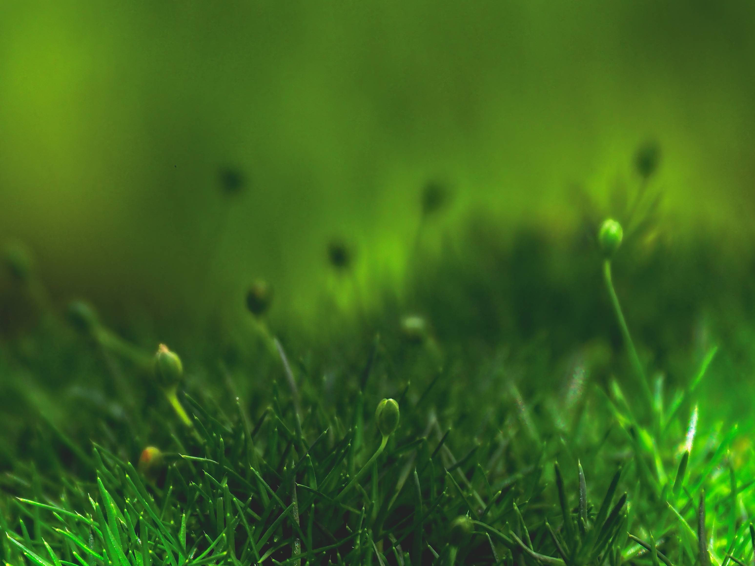
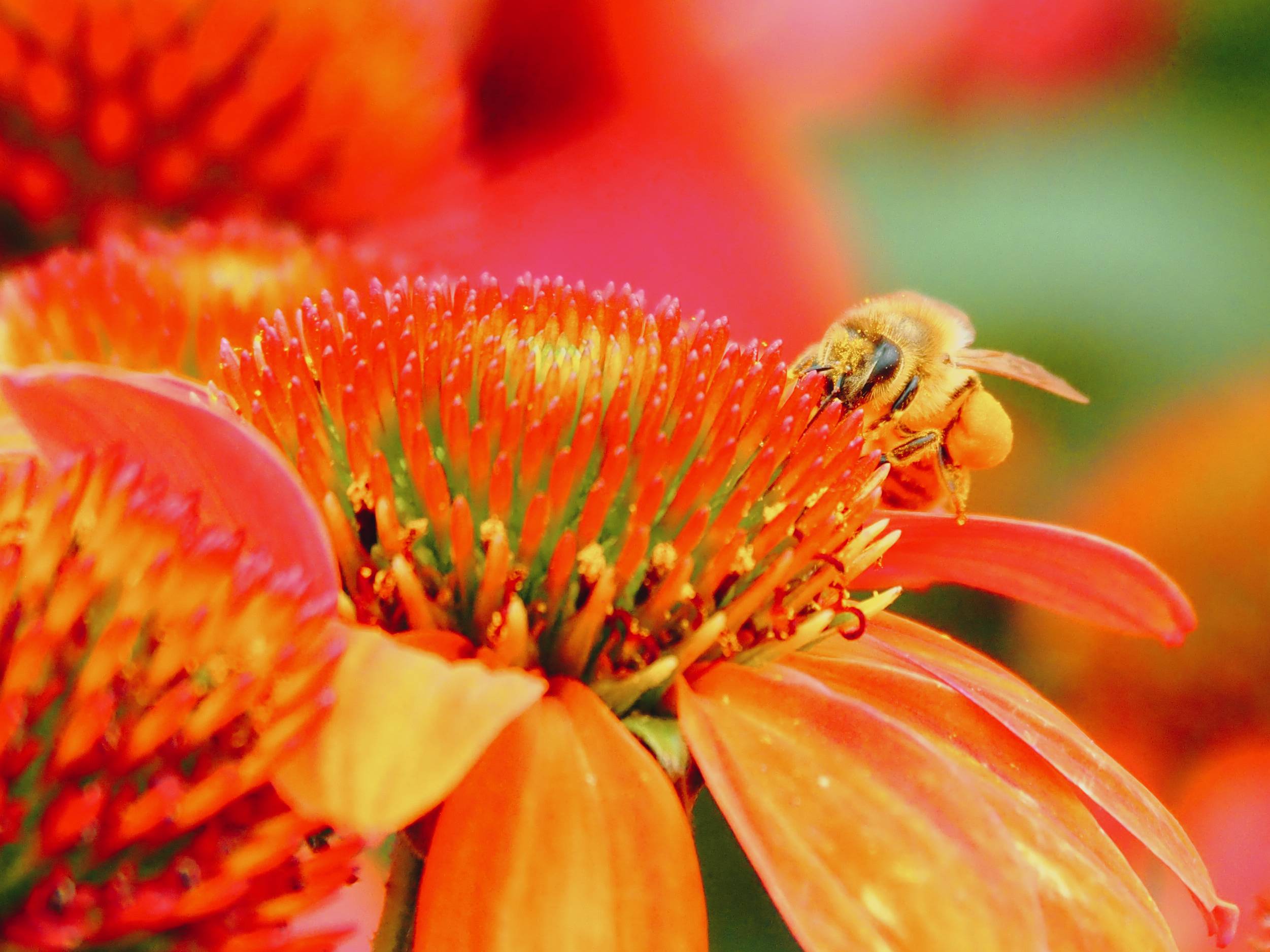
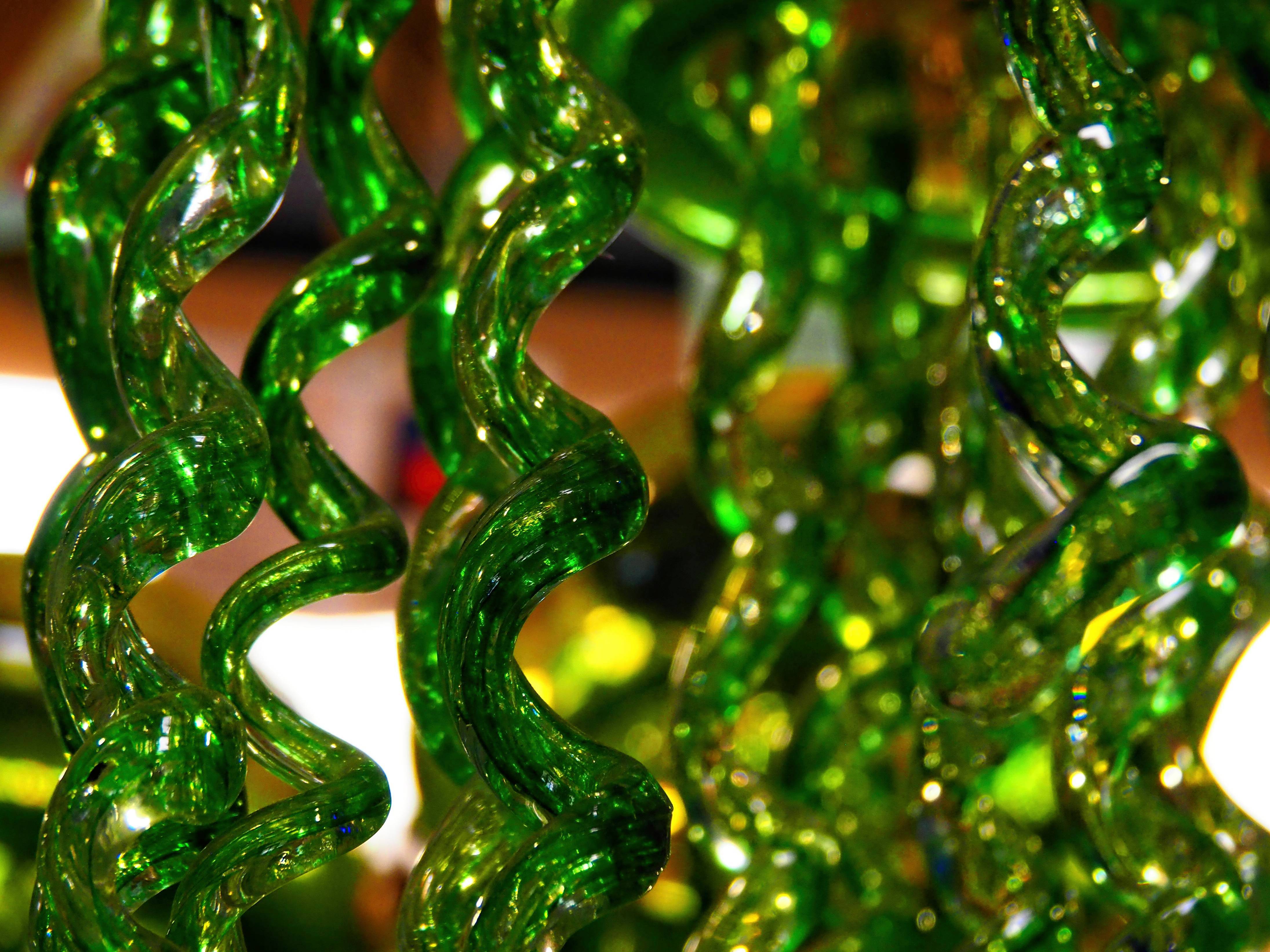
This week my assignment for the 52 photo challenge was to focus on a dominant color in the frame. My mom is visiting from Washington and we went together to the local plant nursery in search of color. It was a warm day and the sunlight was harsh, but we had a lovely time.
Most of these ended up being macro shots, which I think still work. Let me know which one you think best fits the challenge and if you have a favorite. Hope your week is wonderful!


- Photos were taken with an Olympus OM-D and edited with ON1 Photo RAW
- If you want to join the 52 Photo Challenge, you can find all the information at nicolesy.com
52 Photo Challenge
Week 1: Bokeh
Week 2: Silhouette
Week 3: Black and White
Week 4: Motion Blur
Week 5: Texture
Week 6: Framing
Week 7: Leading Lines
Week 8: Negative Space
Week 9: Patterns
Week 10: Symmetry
Week 11: Green
Week 12: Sidelight
Week 13: Sense of Scale
Week 14: One Lens
Week 15: Series
Week 16: Flat Lay
Week 17: Behind the Scenes
Week 18: Water
Week 19: Blurry Foreground
Week 20: Unique Perspective
Week 21: Shadow
Week 22: Food
Week 23: Abstract
Week 24: Reflection
Week 25: Contrast Color
Week 26: Think in Threes
Week 27: Starburst
Week 28: Low Perspective
Week 29: Macro
Week 30: Backlight
Week 31: Big Sky

Love the crisp macro details, especially 2, 8 and 10! 🙂 Those sharp colour contrasts really sparkle here ❤
LikeLiked by 1 person
I’m so happy you like them. Thank you!
LikeLiked by 1 person
Beautiful pictures very detailed.
LikeLiked by 1 person
Thank you so much!
LikeLiked by 1 person
Number four. Or one. Not sure which i like best. 😊
LikeLiked by 1 person
I really like the shadow of the stamen in #1, but #4 is my favorite kind of magical green. Glad you like them.
LikeLiked by 1 person
Fantastic pictures.
LikeLiked by 1 person
You are so kind! Thank you.
LikeLiked by 1 person
🙏🙏🙏
LikeLiked by 1 person
All are excellent macro photos, Bridgette! Well done. ❤️😊
LikeLiked by 1 person
Thank you so much, John! Next weeks prompt is to fill the frame and I am afraid I’ll just fall back on more macro. Trying to think of what to photograph that might work…
LikeLiked by 1 person
That is all up to you, Miss. Photographer! 😊
LikeLiked by 1 person
Many many fine photographs. But one where I took a longer breath.
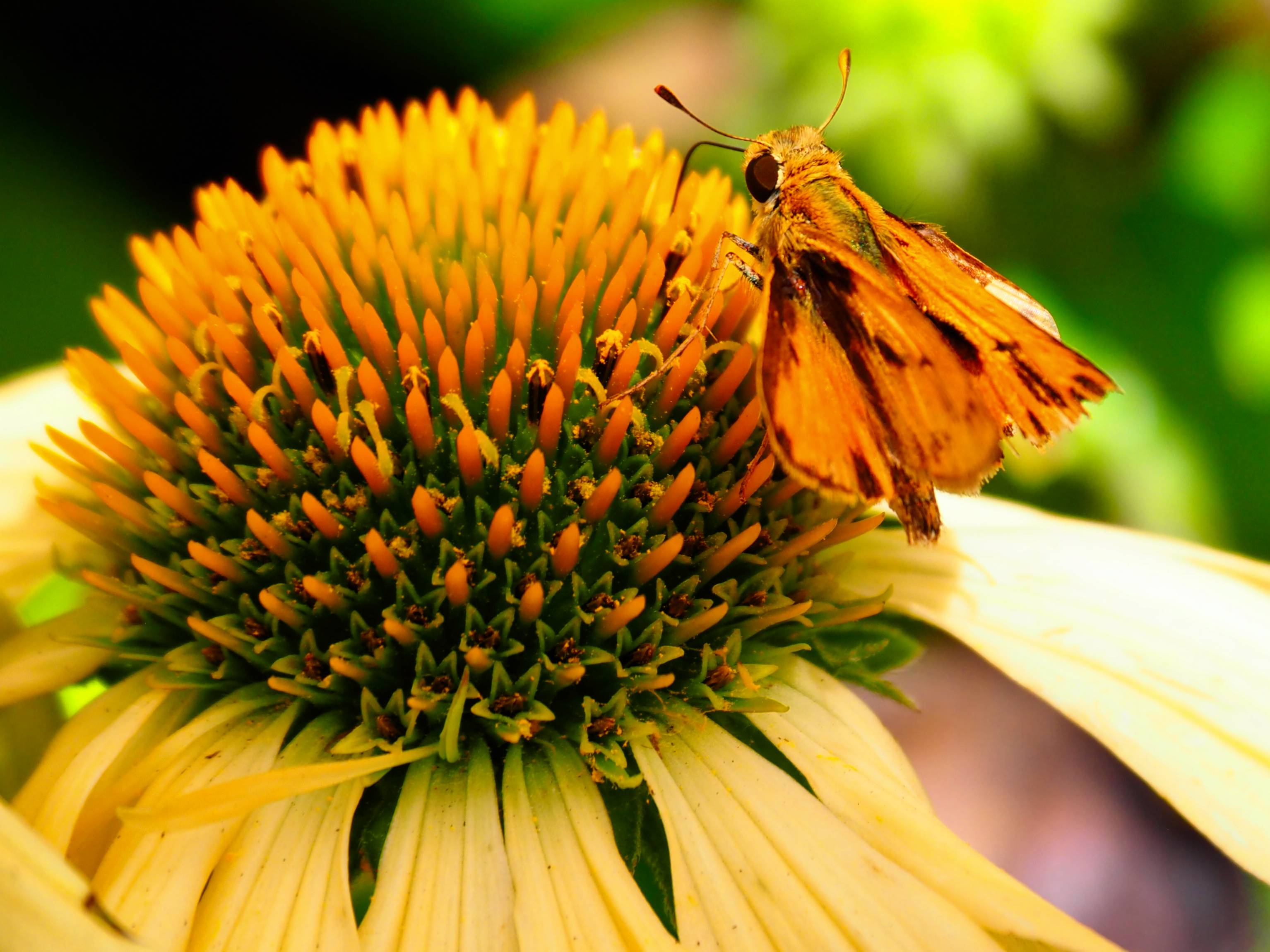
Number seven. I title it, “search for life on another planet.” Subtitled, “Eureka, we found it.” I love purple bees and orange is very interesting – chose that as “my color” once upon a time (don’t know any more). But red? Who can argue with red? Not me. Delicious. Exotic. Double dare you!
Actually I used to love and buy bright red floral shirts, then get them home to realize, no, too bold for me. Nothing I could wear. But that was then and now, the story has changed. Good pictures, thanks for sharing Bridgette.
LikeLiked by 2 people
Thank you! I adore your title of that bright red flower. Your comments always make me smile! I wonder if by “the story has changed” that means you wear those red floral shirts now?
LikeLiked by 1 person
Yep. Not afraid anyway. But still, I lean into Johnny Cash, the man in black – my go to style (unless maybe I was in PG. brings out the floral in me)
LikeLiked by 1 person
Good ones Bridgette. I like the bee peering over the flower 🙂
LikeLiked by 1 person
I liked that one too! Thank you.
LikeLiked by 1 person
Eye-popping, Bridget! My favorites are Nrs. 2 & 8.
LikeLiked by 1 person
Thank you so much! Isn’t that little moth/butterfly adorable? I loved how it matched the color of the flowers.
LikeLiked by 1 person
My favorite is 5, but I can’t explain why…
LikeLiked by 1 person
Thank you! I liked that one too. For me, it’s as if we are peering into the flower world. Perhaps we are the size of that bee. How fun is that?
LikeLiked by 1 person
Yes… So much detail that we miss with the naked eye.
LikeLiked by 1 person
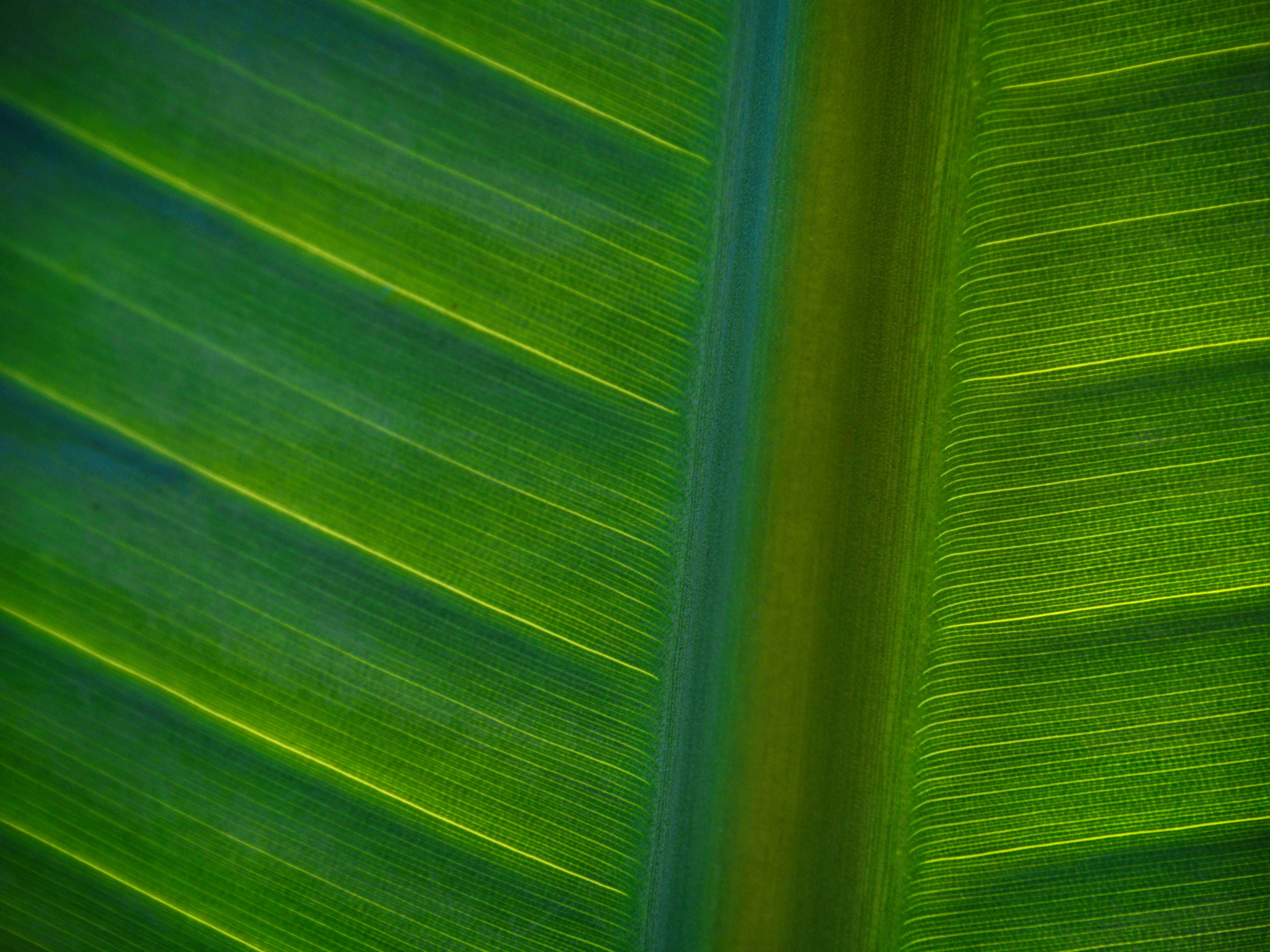
4 and 6, other worldly.
LikeLiked by 1 person
I rather like my photos being called other worldly. Thank you! ❤️
LikeLiked by 1 person
Your mom is cute and that bee photo. Wow!
LikeLiked by 1 person
Thank you!! Yes, I do really love photographing bees. They are so interesting.
LikeLiked by 1 person
Love your work! Maybe some spring you’ll venture to the desert with your camera. 🌵
LikeLiked by 1 person
That would be amazing!
LikeLiked by 1 person
brilliant
LikeLiked by 1 person
That’s high praise 🙂 thank you!! ❤️
LikeLiked by 1 person
The best macro shots. Wonderful photoshoot. All pics are great. I love Frist one & last. And heading yellow 🟡 pic. ❤️
LikeLiked by 1 person
So glad you liked them! Thank you.
LikeLiked by 1 person
Most welcome!
LikeLiked by 1 person
They’re all incredibly beautiful! Going with #8 this time around.
LikeLiked by 1 person
That was one of my favorites too. Thank you for always being so supportive ❤️
LikeLiked by 1 person
I’d choose #4 for the challenge….love all the shades of green. #2 is my favorite, I LOVE how sharp the fronds are against the black backdrop. And the answer is YES to #12. I hope you had a wonderful visit! 💞
LikeLiked by 1 person
Thank you! My mom is staying the entire month so I’ll get to take photos with her at least one more time. Hooray! I was thrilled at how that fern turned out. Glad you like it too!
LikeLiked by 1 person
The photography is stunning. Active life beautifully captured.
LikeLiked by 1 person
What a kind comment! Thank you so much.
LikeLiked by 1 person
My pleasure 🙂
LikeLiked by 1 person
Tough to pick just one! You really knocked this assignment out of the park! I like yellow, so the header photo is one of my faves: it has a bit more drama than some of them. I like #4 and #9 a lot.
LikeLiked by 1 person
Thank you! I’m so happy you liked so many of my photos this week. I rather liked that header image too. Lots to look at with the different flowers, but who can resist the lushness of green?
LikeLike
Stunning shots! Love all the cellular symmetry you’ve captured 🙂
LikeLiked by 1 person
Thank you so much! Close-up shots are my favorite for sure.
LikeLiked by 1 person
Sorry, I’m so very late with my comment, Bridgette. I’m still trying to play catch-up on WP, although I’m afraid I have missed lots of people’s posts recently, and I hate to do that. I do know that you understand me so well, though, and I’m grateful for that.
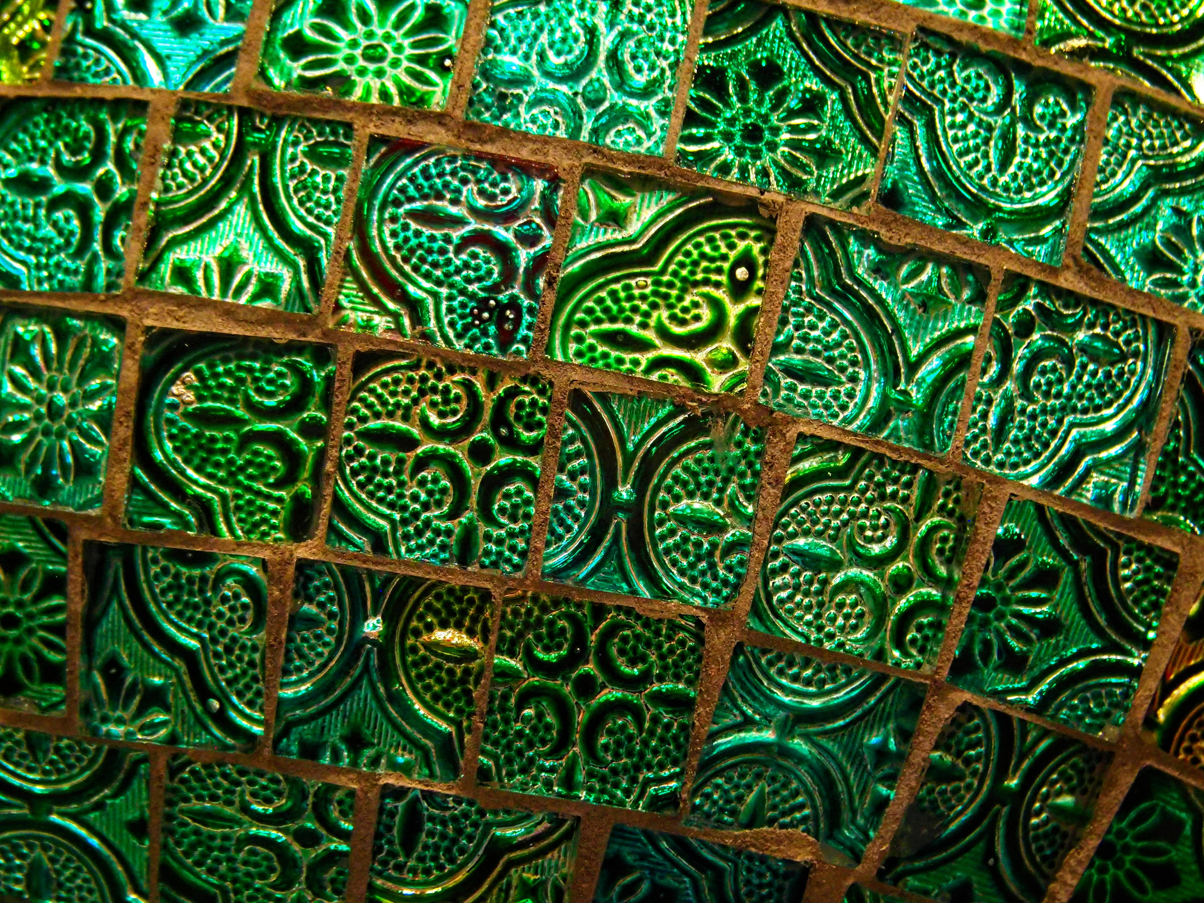
I love all your photos, but my favourite shots are #2, the ferns, which are a vivid, crisp green. Also, I like #5 as the orange colour is so intense, and I love the bee on the flower, too. Finally, I love the mysterious #6 – the green colour being translucent almost looks like glass, but I’m not quite sure. I’d love to know what it is. Much love to you, my friend. Xxx 💓🤗💓✨💓
LikeLiked by 1 person
Thank you for always leaving me such wonderfully kind comments, Ellie. You are such a beautiful person ❤️ #6 is glass! It’s a jellyfish wind chime to hang in the window. It was actually a few of them next to each other. I just liked that angle and the way the light was hitting it. Much love back to you dear friend. Hope you are doing well today ❤️
LikeLiked by 1 person
Wow, these are so vibrant and cool. I like 3, 5, and 8 best.
LikeLiked by 1 person
Thank you! I’m so glad you liked them. Taking photos at the local plant nursery almost feels like cheating as there’s so many beautiful things to photograph.
LikeLiked by 1 person